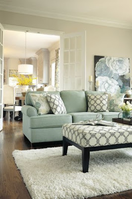
Check out some of the hallmarks of decor predictability in 2016 compiled from an evening of online viewing. Here are a few pics for you. Can you see any similarities in these spaces ?
Here's what I came up with...
- overly coordinated fabrics and accessories
- trays used to corral vignettes on tables
- stacking books in vignettes
- pale rugs
- lots of candles
- box store art
- art that gives you directions (word art)
- antlers and faux taxidermy
- empty frames ( is it a conceptual art statement or just a thing?)
- dishes that match a room's colour scheme
- accessories covering every flat surface
- cute holiday and seasonal vignettes
- beachy colour schemes
- hurricane lanterns
- girlie chandeliers
- mirrors everywhere
- mason jars used for every conceivable purpose
- fake topiary
- changing seasonal/holiday displays
- gallery walls with everything apart from real art
- large wall clocks
- bleached wicker
- overuse of baskets for storage
- and abundance of pillows and throws
- gray everything
- pale wall colours
- family references and a touches of sentiment
Is it a bad thing to be predictable?
Probably not.
We like what we like, and likes are developed through exposure (repeated viewing). In today's world of social media we do a lot of viewing. Likes are also shaped by your social circles, your decorating budget, and what is readily available in a local area. Sometimes we want to be the same as our friends and we model each other.
We all have things we are attracted to and use in different ways in our homes. From the list of overly used elements above I am guilty of: stacking books as fillers and to vary heights, using trays to corral objects in vignettes, layering with throws and using an antler in various arrangements (but it's a real one found on a hike) and I do have a thing about pillows. I am happiest in light rooms and gray has been my go to neutral since 1985. How about you?
Stay tuned for 10 ways to interject a little decor rebellion in your space.


